

TL;DR
- B2B data decays at 2.1% per month; providers claiming 91% accuracy often deliver 63-85% in production.
- Multi-source waterfall enrichment delivers 85-97% match rates vs. 50-65% for single-source APIs.
- Usable Record Rate (fill rate times accuracy rate) is the metric that predicts actual pipeline performance.
- Explorium's 50+ source waterfall achieves 97.8% firmographic accuracy with daily, weekly, and monthly refresh cadences.
- A 7-step testing framework and 10-point field-level checklist let you verify any provider before committing.
Q1. Why B2B Data Accuracy Benchmarks Matter More Than Ever in 2026
⏰ Your Database Is Decaying Right Now
B2B data decays at roughly 2.1% per month. That’s approximately 22.5% of your database going stale every year, with contacts changing jobs, companies getting acquired, emails going invalid, and phone numbers disconnecting. If your provider reported “95% accuracy” in January, you could be working with 80% accuracy by June unless they’re actively refreshing records.
The financial stakes are concrete. Gartner estimates poor data quality costs organizations an average of $12.9 million per year in wasted resources and missed opportunities. That number comes from a survey of 154 large enterprise customers across 16 data quality vendors. For most GTM teams running agent-driven pipelines, the cost shows up long before anyone calculates it: bounced emails, disconnected phones, and agents enriching leads that went cold months ago.
❌ The “Claimed vs. Real” Accuracy Gap
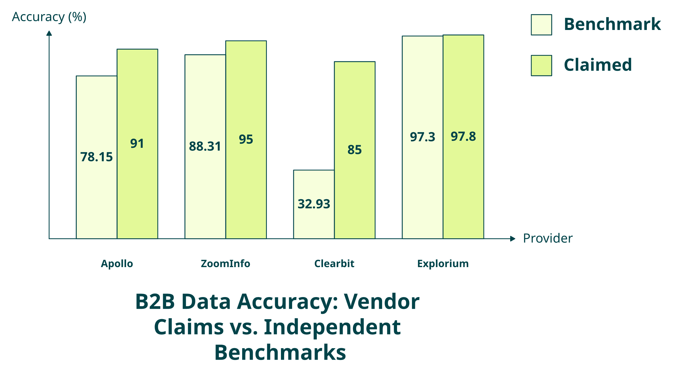
Here’s where it gets uncomfortable for the industry. Providers self-report accuracy numbers on their marketing pages, and buyers take them at face value. Apollo claims 91% accuracy, but independent benchmarks from Amplemarket’s 231-feature study and Salesfinity’s controlled test of 307 verified contacts show real-world performance ranging from 63% to 91% depending on the provider and field type. That’s not a rounding error. That’s a gap wide enough to break your outbound pipeline.
“Contact info frequently missing or incorrect. Half the day calling wrong/disconnected numbers. Mobiles frequently wrong.”
— Verified User, IT Services, Mid-Market Apollo – G2 Verified Review
ZoomInfo and PDL similarly report headline numbers without disclosing methodology, refresh cadence, or field-level breakdowns. The result: teams commit to annual contracts based on marketing claims, then discover match rates that don’t hold in production.
⚠️ Why This Matters More in the Agent Era
In 2024, inaccurate data meant a sales rep wasted 20 minutes on a bad lead. In 2026, inaccurate data means your GTM agent enriches 10,000 leads overnight and 40% come back with stale emails or missing phone numbers. Your pipeline doesn’t just slow; it breaks at scale. Verifiable, field-level benchmarks are now operational infrastructure, not a checkbox during vendor evaluation.
✅ How We Approach This at Explorium
We publish verifiable accuracy benchmarks because our architecture makes them defensible. Aggregating and cross-referencing records across 50+ data sources, Explorium achieves 97.8% accuracy on employee count, 97.8% on website URL, and 97.3% on NAICS code, verified in customer evaluations against Apollo (78.15%), ZoomInfo (88.31%), and Clearbit (32.93%). Our multi-cadence refresh, daily for high-velocity signals like job changes, weekly for contact data, and monthly for firmographics, means these benchmarks reflect sustained accuracy, not Day 0 snapshots.
“Instead of connecting to multiple data sources and APIs, we only require one connection — Explorium!”
— Mirit H., Mid-Market Explorium G2 – Verified Review
💰 Gartner’s $12.9 million figure isn’t theoretical. With B2B databases decaying at 22–30% annually, a data provider that doesn’t publish verifiable, field-level accuracy benchmarks is asking you to trust a number that could be months out of date. This article provides the benchmarks, and the testing methodology, to verify before you buy.
Q2. What Is a Good Match Rate for B2B Data Enrichment APIs? 2026 Benchmarks
A good match rate for B2B data enrichment APIs in 2026 is 85–97% for firmographic fields (company name, employee count, and industry code) and 70–85% for contact fields (email, phone, and job title). Multi-source waterfall providers consistently hit 85–95% overall, while single-source APIs typically land between 50–65%.
📊 The Numbers by Field Type
⭐ Firmographic match rate: Top-tier providers achieve 95–98% on fields like employee count and NAICS code. Average single-source providers land at 78–88%. The gap comes from source breadth: a single database simply can’t cover every company the way cross-referencing 50+ sources can.
Email match rate: Ranges from 78–98% depending on verification methodology. Cleanlist’s 2026 test of 1,000 B2B records found single-source databases matching only 62% of emails, while waterfall enrichment reached 98%.
Phone coverage: Varies dramatically, from 40–85% depending on architecture. Salesfinity’s controlled benchmark across 9 providers showed coverage ranging from 26% to 92%, with accuracy between 63% and 91%.
⏰ Time-adjusted accuracy: Match rates degrade roughly 2.1% per month without active refresh. A provider showing 95% at Day 0 drops to approximately 83% by Day 90 if records aren’t re-verified. Always ask for refresh cadence, not just initial match rate.
Why Waterfall Beats Single-Source by 20–35 Points
The math is straightforward. Any single B2B data provider, no matter how large, has coverage gaps. Provider A might cover 60% of your target accounts with email data. Provider B covers a different 55%. Provider C covers another 50%. Stack them in a waterfall, and combined coverage jumps to 85–95% because each source fills gaps the others miss.
“Data inaccuracies lead to negative outcomes. Wrong personnel details, private employee info listed as company contacts, misdirected communications.”
— Anders J., Developer, Small-Business Apollo – G2 Verified Review
✅ Where Explorium’s Benchmarks Land
Explorium’s 50+ source waterfall achieves 97.8% accuracy on employee count, 97.8% on website URL, and 97.3% on NAICS code, verified in head-to-head customer evaluations against Apollo (78.15%), ZoomInfo (88.31%), and Clearbit (32.93%). Multi-cadence refresh (daily/weekly/monthly by data type) keeps those numbers from decaying the way static databases do.
The industry’s leading GTM platforms, Clay, Cognism, Outreach, and Common Room, rely on Explorium’s enrichment infrastructure because 50+ source cross-referencing delivers sustained match rates that single-source APIs simply cannot maintain at scale.
Q3. How to Measure Fill Rate vs. Accuracy Rate in B2B Data APIs
The Conflation Problem Nobody Talks About
Most B2B data providers report a single “accuracy” number. That’s a problem, because it conflates two fundamentally different metrics that tell you very different things about data quality:
Fill Rate = (Fields Returned with Any Value ÷ Total Fields Requested) × 100
Accuracy Rate = (Correct Values ÷ Total Values Returned) × 100
A provider might return a value for 91% of email fields (high fill rate), but if 15% of those emails bounce, the real accuracy is closer to 77%. Buyers who don’t separate these metrics end up choosing high-fill, low-accuracy providers that look great in the demo but waste outreach credits at scale.
❌ The “Black Box” Numbers Game
Providers like Apollo and PDL report headline accuracy without disclosing whether that number reflects fill rate or verified correctness. When a vendor says “91% accuracy,” ask: is that 91% of records returned a value, or 91% of returned values were verified correct? These are wildly different claims.
“Contact data quality varies wildly — feels like a black box.”
— Verified User, IT Services, Mid-Market Clay – G2 Verified Review
The black box extends further: vendors rarely disclose which source a data point came from, when it was last verified, or whether conflicting values from multiple sources were resolved or simply picked at random.
⭐ The Framework That Actually Matters: Usable Record Rate
The metric that predicts production performance is neither fill rate nor accuracy rate alone. It’s their product:
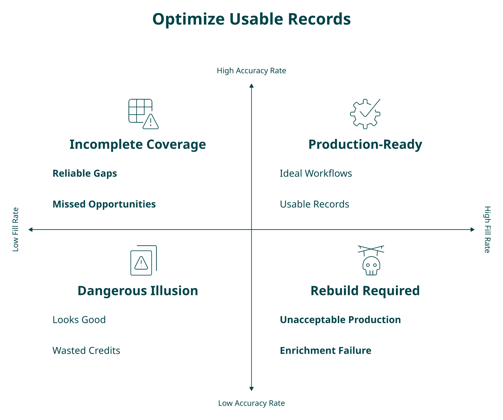
Usable Record Rate = Fill Rate × Accuracy Rate
| ✅ High Accuracy (>90%) | ❌ Low Accuracy (<75%) | |
|---|---|---|
| ✅ High Fill (>90%) | Ideal: production-ready records | ⚠️ Dangerous: looks good on paper, wastes outreach at scale |
| ❌ Low Fill (<70%) | Incomplete: reliable but too many gaps | Unacceptable: rebuild your enrichment stack |
This 2×2 matrix is the fastest way to diagnose whether your data provider is actually delivering value or just filling fields with noise.
How Explorium Maximizes Both Metrics
Explorium’s 50+ source aggregation is architecturally designed to maximize fill rate AND accuracy simultaneously. When Source A returns an email but Source B contradicts it, our system resolves the conflict through cross-referencing rather than returning the first match. That’s the difference between “we found a value” and “we found the right value.”
This is how we achieve 97.8% accuracy on firmographic fields while maintaining high fill rates across 30+ enrichment categories through one API and credit system. You pay once for the best available value, not separately for each source’s attempt.
💰 A Worked Example That Makes the Difference Obvious
Same 1,000-record enrichment request, two architectures:
| Metric | Single-Source API | Explorium Waterfall |
|---|---|---|
| Fill Rate | 82% | 95% |
| Accuracy Rate | 71% | 97% |
| Usable Record Rate | 58% (580 records) | 92% (920 records) |
That’s 920 actionable records vs. 580 from the same input list: a 59% improvement in pipeline-ready data. When your agent is enriching 50,000 leads per month, that gap translates directly into pipeline dollars and connect rates.
Q4. The 2026 Canonical Benchmark Table: Match Rates, Email Accuracy, Phone Connect Rates, and Fill Rates by Provider
Why One Table Matters More Than Ten Vendor Pages
Benchmark data for B2B data APIs is scattered across vendor-commissioned studies, each testing different sample sizes with different methodologies. Salesfinity tested 307 verified contacts across 9 phone data providers. Cleanlist tested 2,000 contacts across 8 enrichment APIs. Amplemarket scored 231 features across major providers. Nobody has aggregated these into one reference.
This table does that. Methodology differences mean you should read ranges rather than exact numbers, but the directional patterns are clear and consistent across studies.
📊 The 2026 B2B Data API Benchmark Table
| Provider | Firmographic Accuracy | Email Accuracy | Phone Coverage | Phone Accuracy | Enrichment Breadth | Pricing Model |
|---|---|---|---|---|---|---|
| Explorium | ⭐ 97.3–97.8% | 90–95% (multi-source verified) | 70–85% (waterfall) | 85–91% | 30+ categories via one API | Credit-based, no subscription |
| Apollo | 78% | 80–88% (claimed 91%) | 50–65% | 63–78% | Contacts + basic firmographics | Monthly subscription |
| ZoomInfo | 88–90% | 85–90% | 60–75% | 75–85% | Firmographics + contacts | Annual contract |
| People Data Labs | 75–82% | 78–85% | 45–60% | 70–80% | Contacts + company data | Usage-based |
| Cognism | 80–85% | 82–88% | 55–70% | 72–85% | Contacts + intent (limited) | Annual contract |
| Lusha | 70–78% | 80–87% | 60–72% | 75–83% | Contacts + basic firmographics | Monthly/annual plans |
| Clearbit | 32–55% | 75–82% | Limited | N/A | Firmographics + contacts | HubSpot-integrated pricing |
| RocketReach | 72–80% | 82–90% | 50–65% | 70–80% | Contacts + company data | Subscription tiers |
Sources: Explorium first-party benchmarks, Salesfinity 2026 phone data study, Cleanlist 2026 API test, Amplemarket provider analysis, and Prospeo aggregated benchmarks.
“Poor data quality, no direct mobile numbers. Numbers either wrong or returns US HQ number even when searching European offices. Not worth the money.”
— Jackie, DE Cognism – Trustpilot Review
“Half of exported data was on spam lists. Phone/email get flagged as spam if you use Apollo regularly.”
— Verified User, Insurance, Small-Business Apollo – G2 Verified Review
📧 Email Deliverability Sub-Benchmarks
Email is where the fill-rate-vs-accuracy gap hits hardest:
✅ Multi-source verified contacts: Bounce rate <1–2%. Top waterfall providers cross-reference email records across sources to surface the most current, verified address.
❌ Single-source unverified contacts: Bounce rate 5–8%. Stale records that single-source providers still return as “valid” account for most of this gap.
⚠️ Catch-all domain risk: 15–25% of B2B emails hit catch-all domains where the server accepts everything. These appear “valid” during verification but may never reach a real inbox. Best-in-class providers flag catch-all domains separately.
Spam trap threshold: Enrichment-sourced lists should show <0.01% spam trap hits. Anything higher signals that the provider’s database includes recycled or outdated addresses.
📞 Phone Connect Rate Sub-Benchmarks
Phone data shows the widest variance across providers, per Salesfinity’s 2026 benchmark:
- ⭐ Mobile number accuracy: 78–91% (top-tier) vs. 63–72% (budget providers) across 9 tested providers
- Coverage gap: Single-source providers cover 40–60% of contacts with phone numbers; waterfall pushes this to 70–85%
- Mobile vs. switchboard: Mobile numbers connect 2–3x more frequently than switchboard/HQ numbers. Providers should classify number type so your dialer can prioritize
- The re-enrichment reality: Even accurate phone data degrades. Salesfinity’s key finding was that continuous re-enrichment outperforms one-time uploads regardless of provider
“Adds a lot of useful and accurate info to our database. Great customer support, the team really cares about our experience.”
— Kobi M., Business Operations Manager Explorium G2 – Verified Review
What makes Explorium’s position in this table structurally different: we aggregate data from multiple specialized providers for each signal type, including several providers in this table, through one API and credit system. Clay, Cognism, and Outreach themselves rely on Explorium’s data infrastructure. We’re not competing with these providers on any single metric. We’re the aggregation layer that combines their strengths and fills their gaps.
Q5. What Causes Low Match Rates in B2B Data APIs, and How to Fix Them
The Scenario That’s Probably Happening Right Now
You enriched 10,000 accounts through your B2B data API last week. Only 5,800 came back with usable records. Your outbound agent is running at 58% capacity because 42% of your pipeline has missing emails, outdated titles, or no phone numbers. Your VP of Sales is asking why connect rates tanked, and you’re wondering why the provider you’re paying $2,000/month can’t match half your list.
This isn’t an edge case. Single-source providers typically deliver 40–60% match rates on contact fields. The gap isn’t random; it has specific, diagnosable root causes.
⚠️ The 6 Root Causes: A Diagnostic Framework
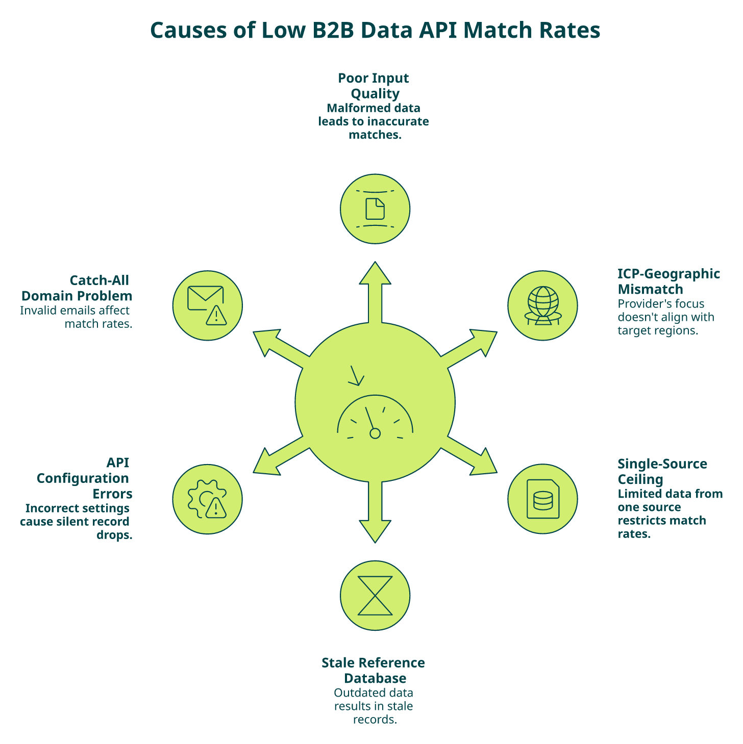
- Poor input quality — Malformed domains, outdated company names, or missing unique identifiers (LinkedIn URL, domain) cause the API to return nothing. Garbage in, garbage out still applies.
- ICP-geographic mismatch — Your provider has strong US coverage, but your target list includes EMEA or APAC. Most single-source databases are heavily weighted toward North America.
- Single-source coverage ceiling — Any individual provider tops out at 50–65% for contact fields. That’s not a bug; it’s the structural limit of one proprietary database.
- Stale reference database — The provider refreshes quarterly instead of daily or weekly. With B2B data decaying at 2.1% per month, a quarterly refresh means up to 6% of records are already stale when returned.
- API configuration errors — Wrong field mapping, batch size limits, or poor timeout handling silently drop records without flagging the failure.
- Catch-all domain problem — The provider returns emails for catch-all domains that appear valid during verification but bounce in production. This affects 15–25% of B2B email addresses.
💸 The Hidden Costs Add Up Fast
- Engineering hours debugging mismatches: 5–10 hrs/week
- Wasted outreach credits on bad data: $0.10–$0.50 per bounced email or dead phone call
- Agent failure cascades: enrichment gaps cause downstream scoring and routing errors that compound across the pipeline
- Pipeline velocity drops 20–30% when match rates fall below 75%
Gartner estimates organizations lose an average of $12.9M/year from poor data quality. Low match rates are where that cost materializes most visibly for GTM teams.
“Old data, bad information, no phone numbers, incorrect mainline numbers, email bounces. Any other data tool is an improvement.”
— Verified User, Computer Software, Mid-Market SalesIntel – G2 Verified Review
✅ How Explorium Fixes Each Root Cause
We built Explorium’s architecture specifically to eliminate these failure modes:
- Single-source ceiling → 50+ source waterfall pushes match rates from 50–60% to 85–95% because each source fills gaps the others miss
- Stale data → Multi-cadence refresh (daily for job changes, weekly for contacts, monthly for firmographics) keeps records current by data type
- Geographic gaps → Global coverage across 150M+ companies and 800M+ contacts eliminates regional blind spots
- Catch-all risk → Cross-source verification catches outdated emails that single-source providers still return as “valid”
- Agent-native MCP lets agents autonomously request only the specific fields needed per workflow, reducing unnecessary enrichment calls and improving effective match rates
“Explorium gives us the data I need when I need it. This saves us a lot of time and money instead of managing each data source separately.”
— Ishi N., Enterprise Explorium G2 – Verified Review
From 58% match rate on a single-source API to 95%+ on a waterfall: that’s the difference between agents running at half capacity and agents operating with full pipeline intelligence.
Q6. How to Test B2B Data API Accuracy Before Committing to a Provider
The Decision Dilemma
Choosing a B2B data API based on vendor-claimed accuracy means trusting self-reported numbers that rarely reflect production performance. Cleanlist’s 2026 test found that most providers claiming 90–98% accuracy delivered 70–85% on real contact lists outside curated demo datasets. The only reliable way to evaluate is to test with your own data, against your own ICP, using a repeatable methodology.
❌ The Wrong Way to Test
Most teams make these mistakes during vendor evaluation: testing with fewer than 50 records, checking only email validity while ignoring phone and firmographic fields, accepting vendor-curated “demo data” instead of submitting their own list, and treating accuracy testing as a one-time pre-purchase exercise instead of continuous monitoring. Each of these shortcuts hides the exact gaps that will hurt you in production.
The 7-Step Testing Framework
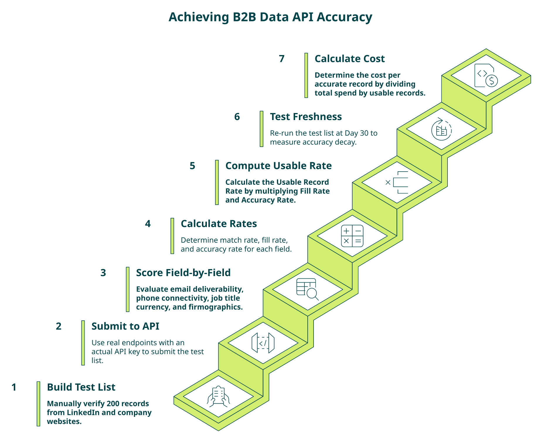
- Build a 200-record ICP test list with known-good data, manually verified from LinkedIn profiles and company websites
- Submit identical lists to each vendor’s API, not their demo environment. Use their production endpoints with your actual API key
- Score field-by-field: email deliverability (run through NeverBounce/ZeroBounce), phone connect rate (sample 50 dials), job title currency (verify on LinkedIn), and firmographic accuracy (check against official filings)
- Calculate match rate, fill rate, AND accuracy rate independently per field using: Fill Rate = Fields Returned ÷ Fields Requested; Accuracy Rate = Correct Values ÷ Values Returned
- Compute Usable Record Rate (fill × accuracy) per field. This is the metric that predicts production performance
- Test freshness: re-run the same list 30 days later and measure decay
- Calculate cost-per-accurate-record (total spend ÷ usable records), not cost-per-credit
⭐ The Field-Level Scoring Checklist
| Checkpoint | Threshold | ✓/✗ |
|---|---|---|
| Employee count accuracy | >95% | ☐ |
| Website URL accuracy | >95% | ☐ |
| NAICS/SIC code accuracy | >90% | ☐ |
| Email bounce rate (verified contacts) | <2% | ☐ |
| Phone accuracy with number type | >80% | ☐ |
| Job title verified within 90 days | Yes | ☐ |
| Revenue/funding data refresh | Quarterly+ | ☐ |
| Technographic signals in same API | Available | ☐ |
| Intent signals in same API | Available | ☐ |
| Refresh cadence documented per data type | Published | ☐ |
Score: 8–10 ✓ = production-grade. 5–7 ✓ = critical gaps. 0–4 ✓ = your enrichment layer is degrading outbound.
“Per-row credit cost can vary 100% from stated amounts. Contact data quality varies wildly, feels like a black box.”
— Verified User, IT Services, Mid-Market Clay – G2 Verified Review
✅ Where Explorium Stands on This Checklist
Explorium scores 10/10 on the checklist above. A free account lets you test immediately without a sales call, and the 50+ source waterfall means your test results reflect production-grade performance, not curated demo data. Documented accuracy benchmarks (97.8% firmographic) are independently verifiable. Our MCP integration lets agents autonomously validate enrichment quality as part of ongoing workflows, checking confidence scores and deciding whether to use or re-enrich without manual intervention.
“Explorium is a great tool for getting data from multiple subscriptions, databases but at a consolidated cost.”
— Omar G., Mid-Market Explorium G2 – Verified Review
Q7. How Does Single-Source API Accuracy Compare to Multi-Source Waterfall Enrichment?
The Fundamental Architecture Choice
The biggest decision in B2B data enrichment isn’t which provider to pick; it’s which architecture to bet on. Single-source APIs (Apollo, PDL, and ZoomInfo) return data from one proprietary database. Multi-source waterfall APIs (Explorium) aggregate and cross-reference data from 50+ providers, returning the most accurate and complete record available. This architectural difference explains the 20–35 percentage point gap in match rates that shows up consistently across independent benchmarks.
❌ Single-Source: Strengths and Structural Limits
✅ Apollo excels at affordable contact data with a built-in prospecting UI and offers contact info for most LinkedIn profiles.
❌ But it operates as a single-source provider, capping contact match rates at 50–65% and firmographic accuracy at 78.15% in head-to-head evaluations.
✅ ZoomInfo offers broad firmographic coverage (85–90% accuracy) and deep company data.
❌ But it locks buyers into rigid annual contracts without transparent per-record pricing.
✅ PDL provides developer-friendly APIs and solid contact coverage.
❌ But without cross-referencing, accuracy degrades faster than multi-source alternatives.
None of these offer intent, technographics, AND contact data through one API, requiring 3–5 separate vendor contracts and manual normalization for teams that need full signal breadth.
“Data is really limited and generally poor quality. Claims 90% mobile coverage in sales process but doesn’t deliver. Diamond Verified mobiles are less than 10%.”
— Alex, AU Cognism – Trustpilot Review
✅ Multi-Source Waterfall: The Math That Matters
The logic is straightforward. Provider A covers 60% of your target accounts with email data. Provider B covers a different 55%. Provider C covers another 50%. Stack them in a waterfall, and combined coverage jumps to 85–95% because each source fills the gaps the others miss.
Architecture Comparison Table
| Dimension | Single-Source (Apollo/ZoomInfo/PDL) | Multi-Source Waterfall (Explorium) |
|---|---|---|
| Data sources | 1 proprietary database | 50+ aggregated providers |
| Firmographic match rate | 78–90% | 95–97.8% |
| Contact match rate | 40–65% | 70–85% |
| Enrichment breadth | Contacts OR firmographics | All signals: contacts, firmographics, intent, technographics, and funding |
| Pricing model | Monthly/annual subscriptions | Credit-based, pay-per-enrichment |
| Agent-native delivery (MCP) | ❌ Not available | ✅ Built-in |
| Refresh cadence transparency | Rarely disclosed | Published per data type |
| Vendor contracts needed | 3–5 for full signal stack | 1 API, 1 credit system |
Sources: Cleanlist 2026, Surfe waterfall comparison, and Enrich.so enrichment guide
“Their product enables us to test multiple data sources and to save money by removing sources that have a poor benefit.”
— Verified User, Financial Services Explorium G2 – Verified Review
Who Should Choose What
Choose a single-source API if you need only basic contact data for manual prospecting and have no agent infrastructure. Choose Explorium if you’re building GTM agents that need multi-source enrichment across firmographics, contacts, intent, and technographics through one API, with agent-native MCP delivery and a unified credit system instead of 3–5 vendor contracts.
Q8. Why Data Freshness Is the Hidden Variable Behind Every Accuracy Benchmark
⏰ The Accuracy Number Everyone Ignores
A match rate benchmark is only meaningful at a point in time. B2B data decays at approximately 2.1% per month. That compounds to roughly 22.5% annually. Some segments see it worse: tech startups experience decay rates as high as 70% per year due to rapid hiring, role changes, and company pivots. A provider reporting “95% accuracy” in January could be sitting at 80% by June if their database isn’t continuously refreshed.
Yet most vendor comparisons and buyer evaluations treat accuracy as a static number, a snapshot frozen in time on a marketing page.
❌ How Providers Hide Behind Stale Data
Providers rarely disclose refresh cadence per data type. A provider might refresh company firmographics quarterly but update contact data only annually, meaning your “high-accuracy” firmographic enrichment sits alongside stale email addresses and outdated job titles in the same API response.
“Company data doesn’t refresh often enough. Only 20% of known contacts could be found, including people at companies for 1+ year.”
— Verified User, Internet, Mid-Market Clearbit – G2 Verified Review
“Not always accurate. Needs more frequent refresh. Lacks robust integrations to easily action on data.”
— Brian Y., Head of Marketing, Small-Business Clearbit – G2 Verified Review
The Right Framework: Time-Adjusted Accuracy
Instead of asking “what’s your accuracy rate?”, ask “what’s your accuracy rate at Day 90?” The practice of measuring match rate at Day 0, Day 30, Day 60, and Day 90 post-enrichment reveals your real accuracy decay curve:
| Provider Tier | Day 0 | Day 30 | Day 60 | Day 90 |
|---|---|---|---|---|
| ⭐ Top-tier (active daily/weekly refresh) | 95–97% | 94–96% | 92–95% | 90–93% |
| Mid-tier (monthly refresh) | 90–95% | 87–92% | 83–88% | 78–84% |
| ❌ Budget (quarterly or no refresh) | 85–90% | 80–85% | 74–79% | 68–74% |
The variable that determines the slope isn’t the provider’s initial accuracy; it’s their refresh cadence.
✅ Explorium’s Multi-Cadence Approach
We refresh different data types at different cadences because one-size-fits-all doesn’t match real-world data velocity:
- Daily: High-velocity signals, including job changes, funding events, and executive appointments
- Weekly: Contact data, including emails, phone numbers, and job titles
- Monthly: Firmographic fields, including employee count, revenue, and NAICS codes
The 50+ source aggregation also means we catch changes faster. If one source updates a record, our cross-referencing system propagates the update across the unified database. This is why customers report sustained accuracy across the enrichment lifecycle, not just Day 0 numbers.
“Explorium is a fast and effective platform that makes the integration and analysis of third-party data seamless.”
— David A., CEO, Mid-Market Explorium G2 – Verified Review
💡 B2B databases decay at 22–30% annually. Nearly a third of your enriched pipeline becomes unusable every year without active refresh. When evaluating providers, don’t just ask “what’s your accuracy rate?”. Ask “what’s your accuracy rate at Day 90, and what’s your refresh cadence per data type?”
Q9. How to Build a Continuous B2B Data Accuracy Monitoring System for Production
A production-grade B2B data pipeline doesn’t just test accuracy once during vendor selection. It monitors enrichment quality continuously using automated validation loops that flag degradation before it impacts outbound performance.
🏗️ The 4-Layer Monitoring Architecture
Most engineering teams build an agent, get it working in staging, push to production, and then have zero visibility into what happens next. Here’s the architecture that closes that gap:
Layer 1, Enrichment + Logging:
Every API call to your B2B data provider gets logged with full response metadata: fields returned, fields empty, response time, and credit consumed. This creates the raw dataset your monitoring system runs on.
Layer 2, Validation Sampling:
Sample 5–10% of enriched records weekly and cross-reference against known-good sources: LinkedIn profiles, company websites, and email verification tools like NeverBounce or ZeroBounce. This catches accuracy drift that aggregate metrics hide.
Layer 3, Rolling Accuracy Scoring:
Calculate rolling 30-day match rate, fill rate, and accuracy rate per field. Don’t average across all fields. A provider might deliver 95% accuracy on employee count while dropping to 72% on email addresses. Field-level granularity reveals where degradation starts.
Layer 4, Threshold Alerts:
Set alerts for when any metric drops below your production threshold. Example triggers:
| Metric | ⚠️ Warning Threshold | ❌ Critical Threshold |
|---|---|---|
| Email accuracy | <90% | <85% |
| Phone coverage | <70% | <60% |
| Firmographic match rate | <92% | <88% |
| Fill rate (any field) | <80% | <70% |
When an alert fires, you have a data-driven case for re-enrichment, provider renegotiation, or switching, not a gut feeling.
⭐ What Continuous Monitoring Enables
- Catch provider accuracy drops before they tank outbound connect rates
- Compare multiple providers in production, not just in vendor demos
- Identify which specific fields are degrading fastest and prioritize fixes
- Build data-driven cases for switching or renegotiating provider contracts
- Feed accuracy confidence scores into agent decision logic: skip records below confidence threshold, or auto-re-enrich stale records before they hit outreach
“Depending on where the data is coming from, the data can often be mismatched or have outdated information. It is best to cross-reference the output data from other enriched information.”
— Omar G., Mid-Market Explorium G2 – Verified Review
This review captures exactly why monitoring matters. Even with good providers, cross-referencing is essential. The question is whether you do it manually or build a system.
✅ Why Explorium Makes This Easier
We designed Explorium’s architecture to make continuous monitoring a built-in capability rather than a custom engineering project:
- MCP-integrated validation: Agents autonomously validate enrichment quality as part of the workflow. The agent requests a record, checks confidence metadata, and decides whether to use or re-enrich, without manual intervention. Learn more about Explorium’s MCP integration.
- One dashboard instead of five: The unified API means you monitor one source across firmographics, contacts, intent, technographics, and funding signals. No reconciling 3–5 separate provider dashboards with different metrics and counting methods.
- Cost-efficient re-enrichment: The transparent credit system means re-enriching stale records doesn’t require separate contracts per re-verification attempt. One credit pool covers all signal types.
- Response header transparency: We return rate-limit headers (X-RateLimit-Remaining, Retry-After) on every API response, standard, not premium, because production agents need programmatic visibility to self-regulate.
“The richness and breadth of data is incredible. I really like the instant access to the most useful and reliable external data. It helps us provide better service to our customers because it is the data we need to make faster and better decisions.”
— Ishi N., Enterprise Explorium G2 – Verified Review
Think of it as giving your agent a dedicated data quality team that validates every enrichment before it enters your pipeline, running 24/7 at a fraction of the cost of manual QA. Explorium powers this for the industry’s leading GTM platforms, including Clay, Cognism, and Outreach, because sustained accuracy requires infrastructure, not just initial benchmarks.
FAQs


